Street Sign or Painted Mark: Which Helps at a Glance?
Street sign or painted mark: compare sightlines, attention and visual clutter to choose a cue people can spot and understand before they need to act.
Which cue will a visitor notice before reaching a turn: a street sign or a painted mark? The answer depends on the approach, the competing shapes in view and where people are already looking. An upright sign can enter the forward view; a painted mark uses a surface within the route.
These formats do different jobs. A sign can announce a decision ahead, while a surface mark can confirm a movement nearby. Start by locating the decision point, then consider which cue will be visible in time.
A sign enters the forward view
A freestanding or wall-mounted sign is upright, so someone can notice it while looking along a street or across a public space. Its height may lift it above paving patterns, parked bicycles or low planting. Buildings, trees and other signs can still block the view.
An upright sign suits information that people need before choosing a route. A short destination name, a familiar symbol and an arrow can be read while a visitor is still approaching a junction or entrance.
Prominence can also create competition. Several boards along one pavement may merge with shop fascias, temporary notices and street furniture. Another sign will not necessarily clarify the route if it joins an already crowded view.
Check the approach from both directions and, where relevant, from a seated viewpoint. A sign that looks clear beside it may disappear behind a tree or against a busy shopfront when seen from the route. The useful question is whether its face becomes visible before the decision, not just whether its lettering is legible at close range.
A painted mark belongs to the surface
A painted arrow, line or symbol can make a route legible without adding another object to the street. It can use paving, a wall or a kerb, which may help where a narrow footway has little room for a post.
Surface markings suit simple, immediate actions: keep to one side, follow a short path across a forecourt or identify a waiting area. A sequence of small cues can guide someone through a space, but the first must be visible where the choice begins.
A mark on the ground asks people to look down. That may fit a moment when they are watching their footing, but it is less suitable when they need to watch traffic, other pedestrians or an approaching doorway. A queue, delivery trolley or fallen leaves can also cover a painted arrow.
Consider the viewing angle as well as the material. A ground mark can look narrow from a distance, while a wall mark can disappear among brick joints, posters or shop displays. Ask whether people naturally look towards that surface at the point when the message matters.
Let the decision point choose the medium
Place a cue where someone needs to act, with enough lead-in to understand it. A sign can name a destination before a junction; a painted arrow can confirm the direction after the turn. Neither is automatically clearer: the relationship between the cue and the decision matters most.
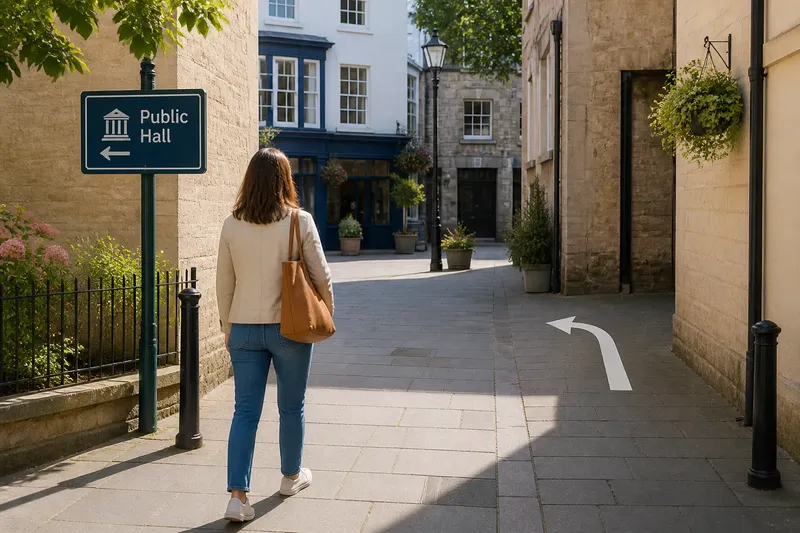
Say a visitor reaches a small paved square with two passages out. Imagine the public hall is through the left passage, but its entrance cannot be seen from the square. The starting conditions are two possible routes and no view of the destination. Put a modest upright sign at the approach, naming the hall and pointing left; place a painted arrow at the left passage to confirm the turn. The expected observable result is that the visitor can identify the route before entering the square and check it at the turn. The trade-off is an extra object in the forward view, so the sign should use a quiet background and a brief message.
In a simpler setting, one cue may suffice. If a short painted line leads to a visible entrance and there is no competing route, a freestanding board may add visual noise rather than useful information. Across a broad, plain plaza, an upright sign visible from the approach may be easier to locate than a small mark underfoot.
Match the message to the decision. At a junction, a destination name and arrow may be enough. A painted mark can repeat a simple direction, but it is a poor place for instructions that require a pause and several lines of reading.
How do sightlines and visual clutter change the choice?
What should I check from the approach?
Stand where a visitor is likely to arrive and look towards the next decision. Notice anything that overlaps the sightline, such as parked vehicles, planting, street furniture, open doors or people waiting. If the cue appears only after the decision point, move it or choose a format visible earlier.
When is a painted arrow easier to notice?
A painted arrow can be easy to follow when the route is short, the surface is usually unobstructed and people naturally look towards it. If people need to watch ahead or the mark may be covered, choose a wall or kerb location in their normal view, or use an upright sign instead.
Does a sign need to be the largest object nearby?
No: its position and contrast with the surroundings can matter more than sheer size. A compact panel against a quiet background may stand out better than a larger board among shop signs and notices. Keep the message brief and let the arrow or symbol remain easy to pick out.
Can signs and painted marks be used together?
Yes, when they do different jobs. A sign can name the route at a distance, while a surface mark confirms the next movement at a junction. If the cues suggest different directions, revise their placement or wording so they agree.
Read the background before adding a cue
Visual clutter is not simply a count of objects. It is the collection of shapes, colours and messages competing for attention from one viewpoint. A street with many shop signs may still have a quiet patch of wall; a nearly empty forecourt may have patterned paving that makes a painted symbol hard to distinguish.
Look for a background that separates the cue from its surroundings. A sign may need a plain backing against a busy façade. A painted mark may be clearer on an unbroken section of paving than among repairs, joints and contrasting materials. Putting a new cue beside another arrow or notice can blur their meanings.
Check the view from the height and angle of the people expected to use the route. Children, wheelchair users and people pushing prams may see a different part of the scene from a standing adult. A high sign can be missed from a lower viewpoint; a ground mark can be covered by someone standing over it. Add a second cue only if it addresses a specific gap, rather than as decoration.
Colour contrast helps only while the cue stays distinct under ordinary changes in light and surroundings. A bright mark against pale paving may become hard to see where the paving changes. If the surface varies along the route, a sign face can offer a more consistent background.
Choose a cue people can read without stopping
At a glance, someone needs to recognise the message, understand its direction and connect it to a real feature in the place. Use familiar arrows and symbols where they fit, name destinations plainly and avoid abbreviations that only regular users understand. A sign with too many destinations can take longer to scan than separate cues at separate decision points.
Keep arrows close to the destination they describe. On a sign, an arrow placed far from its text may seem to point to the wrong line. On a painted route, the arrow should match the path people can follow; showing a sharp turn as a straight line can cause hesitation. Read the cue from the approach, not only from beside it.
Consider whether the message will stay current. A temporary event direction may suit a removable board better than permanent paint. A route that changes during construction may need an updateable sign, while an unchanging boundary may suit a surface marking. Choose materials and placement for the specific setting, following the maker’s instructions and any applicable local rules.
- Check whether the cue is visible before the decision; if it appears too late, move it earlier or choose a format visible from farther along the approach.
- Check whether people naturally look towards the surface; if they do, a painted mark may suit, and if they look ahead, use an upright sign or a wall-mounted cue.
- Check for parked vehicles, planting, queues or deliveries that could hide the cue; if they block it, relocate the cue or add a second one in a clear view.
- Check whether paving patterns or nearby notices compete with the message; if they do, use a quieter surface or give a sign a plain backing.
- Check whether the route is temporary or likely to change; if it may change, use a removable or updateable cue, and if it is stable, consider a lasting mark.
- Check whether the arrow and destination name clearly belong together; if they do not, reposition or simplify them, or split the message across separate decision points.
For a quick choice between a street sign and a painted mark, identify where the viewer first needs to know, what they are looking at then and what could hide the cue. A forward view and an early choice often favour a sign; a clear nearby surface and a simple movement may favour paint. The best cue is the one people can see and understand at the right moment without making the rest of the place harder to read.