A Noticeboard People Can Actually Read
Noticeboard design helps visitors find local information, read its details and decide what to do next through clearer grouping, hierarchy and legibility.
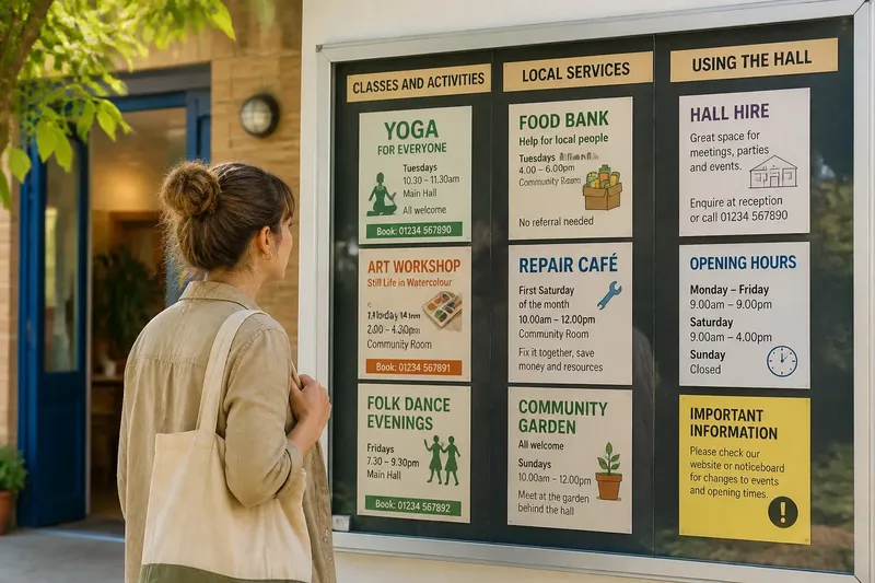
How can someone find the right notice in a community hall without stopping to decode the whole board? Noticeboard design starts with the visitor’s route: what they see from the entrance, where they pause and how quickly they can pick out the information they need. A readable board gives notices a clear order and makes the next action easy to understand.
Read the board as a visitor would, from its usual approach and viewing distance. Then identify the first obstacle: perhaps similar notices are scattered, one bright sheet overwhelms everything else, or important details are difficult to read. Grouping, hierarchy and legibility address different problems, so the right first change depends on what is getting in the way.
Grouping connects notices to visitors’ questions
Grouping means placing related information together so people can search by purpose rather than scan every sheet. A community hall might have areas for activities, local services and information about using the building. These categories should reflect visitors’ likely questions, not the committees or departments that produced the notices.
Look for clusters that have formed informally. Several class flyers may already sit together, while a repair notice is stranded among them. Plain labels on card can make useful groups visible. Keep labels short and familiar; a heading such as “Classes and activities” gives a visitor more to work with than an internal committee name.
Grouping is useful when a board holds recurring subjects and visitors arrive looking for particular information. It is less helpful when only a few notices are displayed or when separating related items makes them harder to compare. Avoid a category that exists for a single isolated sheet unless that distinction genuinely helps visitors find it.
Hierarchy guides attention across the board
Hierarchy is the visual order in which information attracts attention. On an individual notice, the event or service name can lead, followed by the main action and practical details. Contact information and background can come later, provided the reader can still find them.
The whole board also needs a hierarchy. A brightly coloured flyer can dominate even after its event has passed, while a useful opening-hours notice disappears beside it. Use consistent placement or a modest heading style to signal importance rather than making every sheet larger, brighter or bolder.
This approach suits a board where visitors need to spot a regularly sought notice quickly, or where individually clear sheets collectively create visual noise. If every notice is marked as urgent, however, the signal loses its meaning. A simple distinction between general information and time-sensitive notices is often easier to scan.
Legibility makes details usable
Legibility describes how easily the words themselves can be read. Consider type size, letter spacing, contrast, paper condition and the distance from which visitors read the board. Pale print on a light background, narrow lettering, dense paragraphs and curled corners can make a notice difficult to use even when its heading stands out.
Check whether someone can pick out what is happening, where and when it takes place, and how to respond. Familiar typefaces such as Arial or Calibri are generally easier to read than decorative lettering. Dark text on a plain, light background, short lines and clear spacing help details stand apart. Avoid writing over photographs or patterned paper; for handwritten notices, a broad dark marker is easier to see than fine pen strokes.
Choose legibility as the first focus when visitors find the right sheet but struggle with its details. If the sheets are readable individually but the board still feels confusing, changing the typeface will not resolve a problem with grouping or hierarchy.
A close reading points to a practical decision
Stand on the approach visitors normally use and inspect the board under its usual lighting. For every item below, note the observation and follow the decision that matches it. This keeps the review tied to specific changes rather than a general instruction to make the board clearer.
- Approach: Check whether the board is visible from the entrance or path. If a door, pillar or other obstruction hides it, then clear the obstruction if possible; otherwise, consider a more visible position.
- Grouping: Check whether related notices sit together. If they are scattered, then arrange them under a few visitor-friendly subjects; otherwise, keep the groups and avoid adding unnecessary categories.
- Labels: Check whether each group label makes sense without local committee knowledge. If it uses vague or internal wording, then replace it with a plain description; otherwise, retain the wording.
- Hierarchy: Check whether the main subject of each notice is easy to spot. If headings compete, then give them a consistent, distinct treatment; otherwise, leave their visual order alone.
- Essential details: Check whether readers can find the place, time and action without searching through a long paragraph. If those details are buried, then bring them forward or shorten the wording; otherwise, keep the existing text order.
- Contrast: Check whether text remains distinct from its background under the board’s actual lighting. If it does not, then use a clearer colour combination and remove busy backgrounds; otherwise, preserve the current contrast.
- Condition: Check whether sheets are flat, clean and unobscured. If a notice is curled, damaged or covered, then flatten or replace it as appropriate; otherwise, leave it in place.
Say a neighbourhood centre has three activity flyers on its board. In this invented situation, each flyer already sits in the activities group, but the dates appear in small print at the bottom and visitors are overlooking them. The caretaker checks that the event dates are still current, asks each organiser to move the date and booking details nearer the heading, then places the revised sheets back in the same group. The expected observable result is that a visitor can compare dates and booking details before reading the rest of each flyer; grouping and board location remain unchanged.
Which noticeboard change fits the problem?
How can I tell whether grouping is the problem?
If visitors scan across the whole board for a familiar subject, its categories may be unclear or absent. Sort the current notices into a few plain-language groups and check whether those groups match what visitors come to find.
Should every notice use the same layout?
Not necessarily, but a shared order for the heading, essential details and contact information makes notices easier to compare. Organisations can keep their own identity while giving the information visitors need a consistent place.
What should I change when a board is crowded?
Check first whether notices overlap, compete for attention or lack a clear place. If material needs to be removed or rearranged, follow the community’s usual process; shrinking text or squeezing sheets into tighter rows can make the board harder to use.
Which approach should I try first?
Choose grouping when visitors cannot find the right subject, hierarchy when one notice overwhelms the others, and legibility when a found notice is hard to read. If several problems appear together, start with the one that prevents the visitor’s next action.
Choose the change that removes the first obstacle
A useful review ends with a specific decision. Keep the arrangement if visitors can find the right subject; adjust the visual order if attention goes to the wrong place; improve lettering or contrast if details resist reading. Good noticeboard design helps a visitor move from finding local information to understanding what to do next.